As Altelis grew, so did the complexity of its internal operations.
What started as a simple internal tool to manage clients, contracts, and invoices gradually evolved into an ambitious all-in-one platform meant to support the entire team.
But over time, the tool was left behind.
New software was introduced, information became scattered across multiple platforms, and the internal tool slowly lost its role as a reliable source of truth. Team members stopped trusting it, and eventually stopped using it altogether.
This project focused on redesigning Altelis Tools to restore trust, clarity, and efficiency within the team.
My role was to understand how each team member worked, identify why information was no longer accessible or reliable, and redesign part of the platform into a centralized, role-based dashboard that connected existing tools instead of replacing them.
The goal wasn’t to add more features : it was to give the team back time, confidence, and a shared understanding of their work.
Altelis is a digital agency based near Paris, specializing in tailor-made websites for hotels and restaurants across France.
As the agency expanded, the development team built an internal platform to help the CEO and accountant manage client data, contracts, and invoices more efficiently.
Over time, the tool evolved into Altelis Tools, with new features added to support project management, maintenance tracking, client support, and subscriptions.
The vision was clear:
One centralized place where the team could stay organized, informed, and aligned.
But without maintenance, clear ownership, or a defined structure, the tool slowly drifted away from its original purpose until it became more of a burden than a solution.
As time passed, the tool was left without maintenance. Meanwhile, new software was introduced for accounting, project tracking, and client invoicing, scattering information across multiple platforms.
Important details like contract terms, client contacts, or project data were split between different tools. New hires often felt lost, struggling to piece together outdated or missing information.
During meetings or client calls, the team frequently discovered that key details were wrong, or not documented at all. This led to confusion, frustration, and wasted time.
Team members couldn’t trust the information they found. They often had to confirm details with colleagues, creating unnecessary back-and-forth and slowing down their work.
As everyone worked with different versions of the truth, processes became slower and more expensive. Repetitive projects took longer, and miscommunication started to impact client relationships and overall productivity.
In short, what was meant to be a centralized productivity tool had turned into an obsolete hub of unreliable information.
The team stopped using it altogether, and as Altelis continued to grow, the lack of a single source of truth began to hurt efficiency, collaboration, and client management.
This project aimed to address three key challenges within the team :
Making it faster and easier for anyone to find the right piece of information without relying on others.
By streamlining access to essential data and minimizing repetitive, manual steps.
By ensuring information is accurate, consistent, and automatically updated from reliable sources.
To better understand how the team experienced the tool, I interviewed and observed several colleagues in their day-to-day tasks.
My goal was simple: understand how they searched for client or project information, and what obstacles they faced.
What I discovered was that information retrieval relied mostly on people, not systems.
If someone needed details about a website’s development, they’d ask the developer who built it. Business-related questions went straight to the CEO. Access to tools? You had to ask the main dev for permissions each time.
This constant dependency slowed everyone down and created frustration within the team.
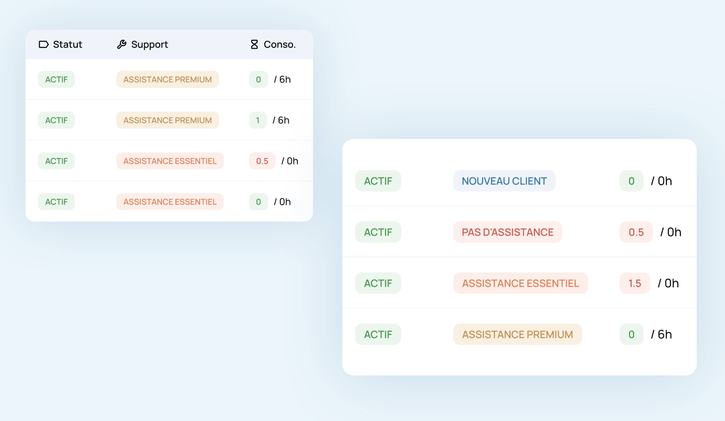
Tracking maintenance hours was confusing.
Data was displayed in percentages : but 100% of 6 hours and 100% of 40 hours don’t mean the same thing.
Both designers and project managers struggled to understand what the numbers actually represented, leading to billing or tracking mistakes.
Each role needed specific information : developers wanted technical data, designers needed client feedback, the accountant needed billing insights.
But everyone faced the same challenge: information was hard to find and impossible to trust.
New hires felt overwhelmed, unsure who to ask for what. The lack of a clear structure or reliable source of truth made onboarding unnecessarily complex.
Team members felt they were wasting time asking for access or verifying data instead of focusing on meaningful work. The process felt inefficient and demotivating.
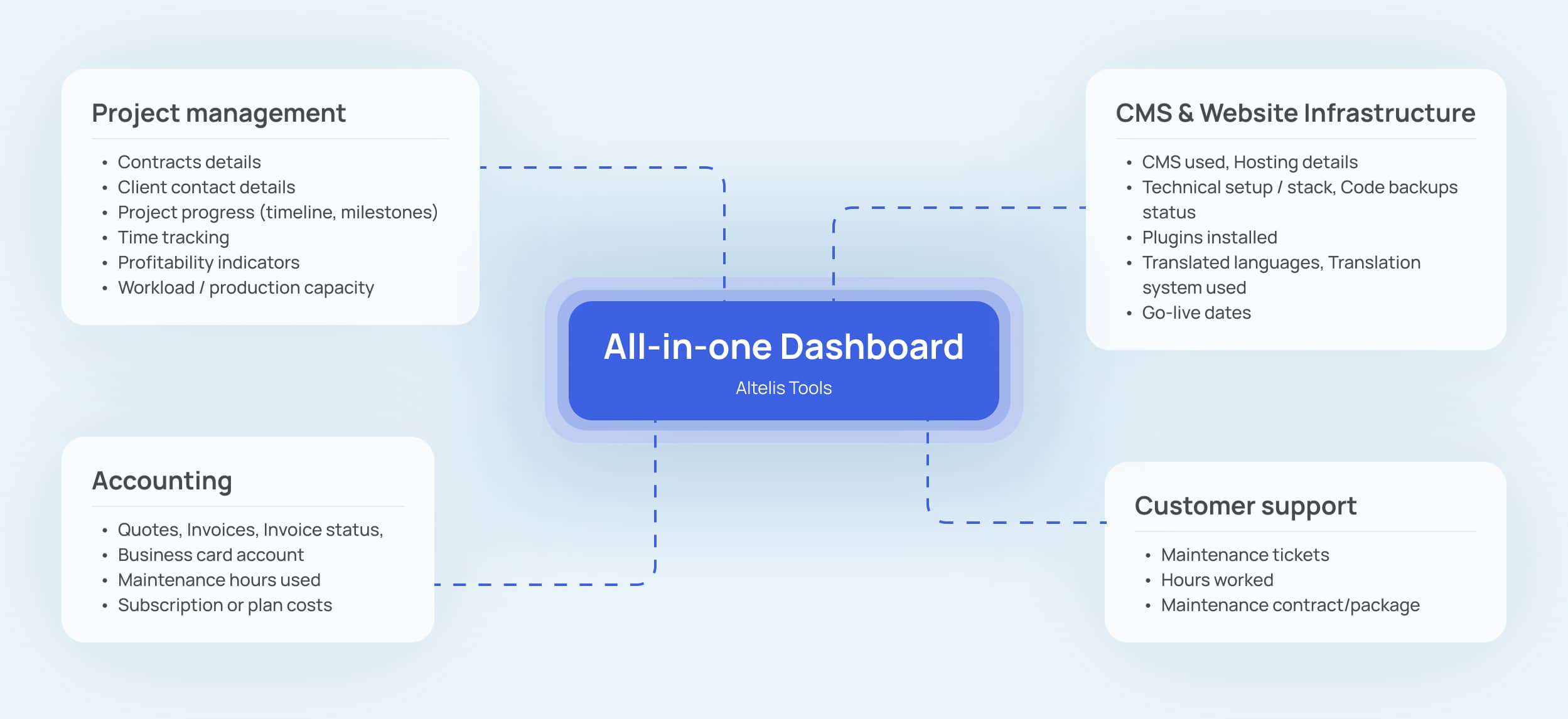
To solve this, I needed to understand what each team member truly needed to work efficiently. So, I mapped out the essential data per role:
Once I identified the needs, a clear opportunity appeared:
What if we could centralize all this information in a single, easy-to-use interface, tailored to each expertise?
That’s when I suggested to redesign part of the forgotten Altelis Tools platform, transforming it into a reliable, dynamic source of truth for the entire team.
The goal wasn’t to replace every tool the company used : it was to connect them.
I wanted to rebuild Altelis Tools into a centralized hub that automatically pulled the most accurate information from existing sources, ensuring it stayed up-to-date without manual effort.
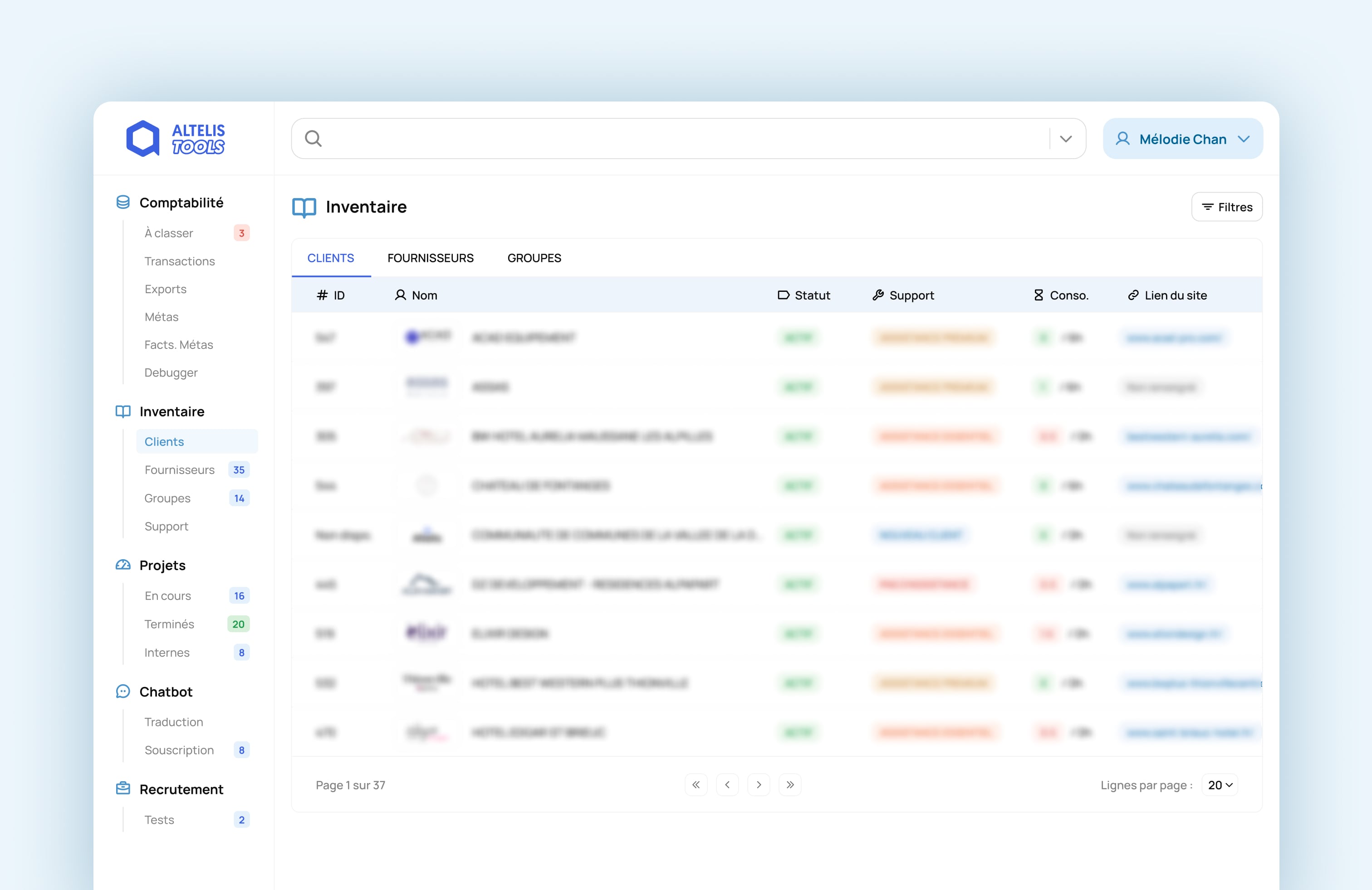
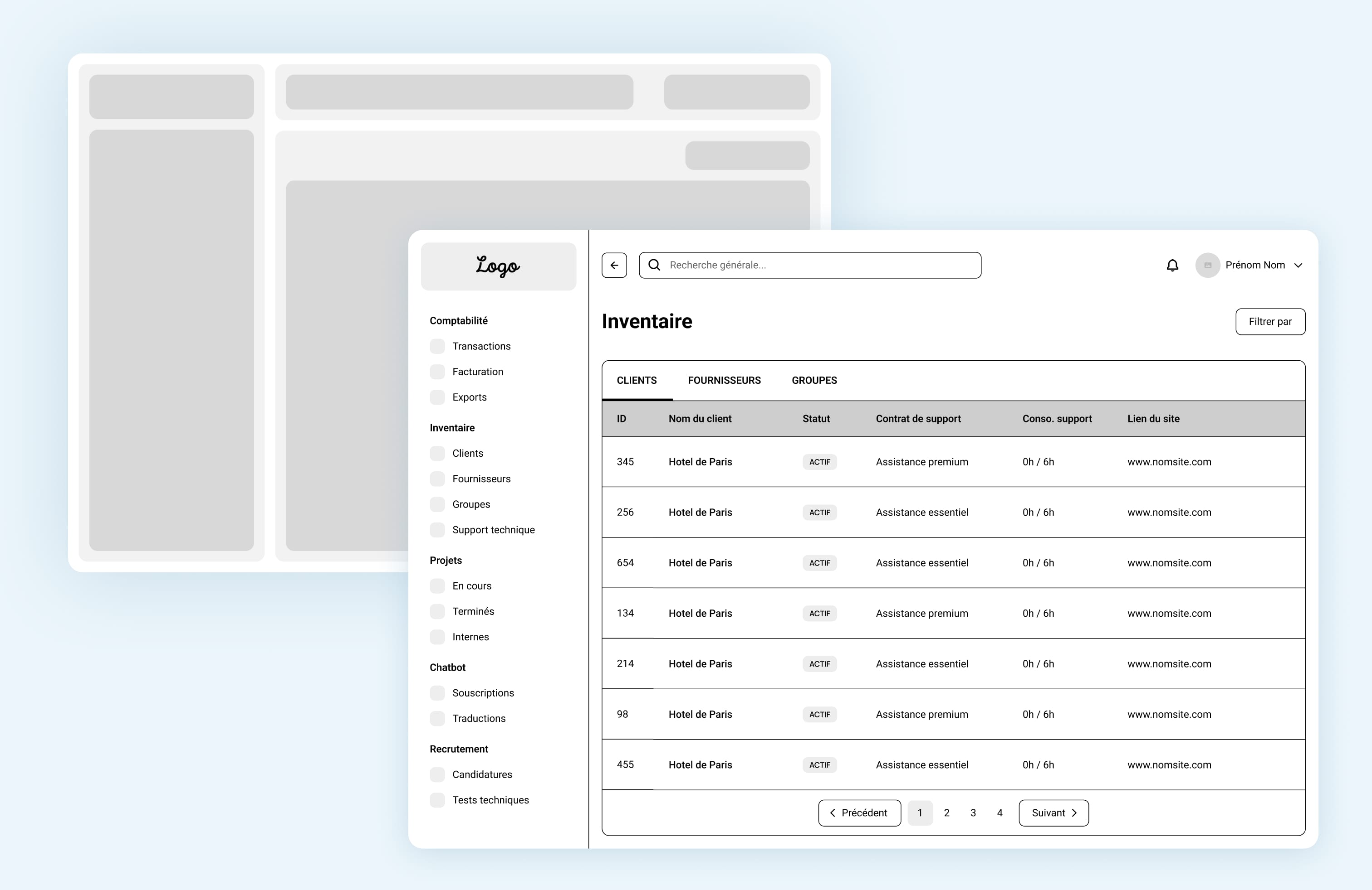
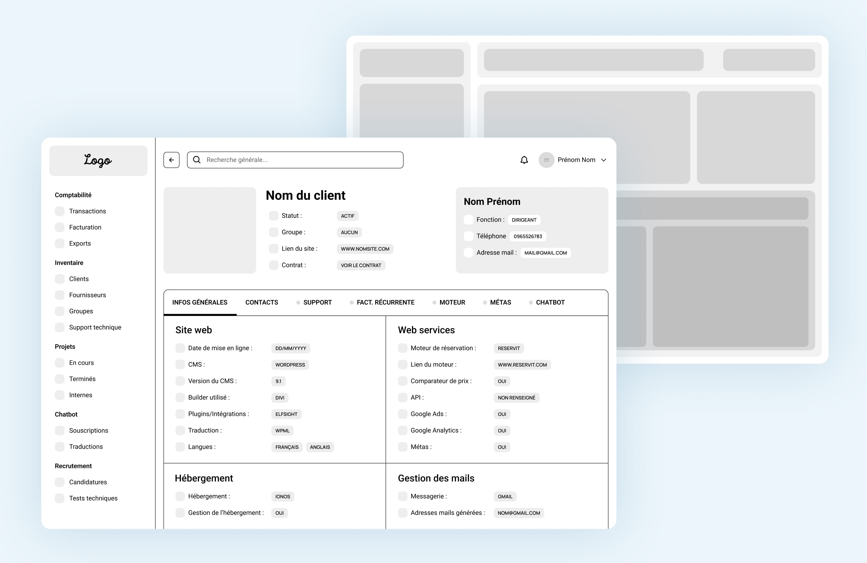
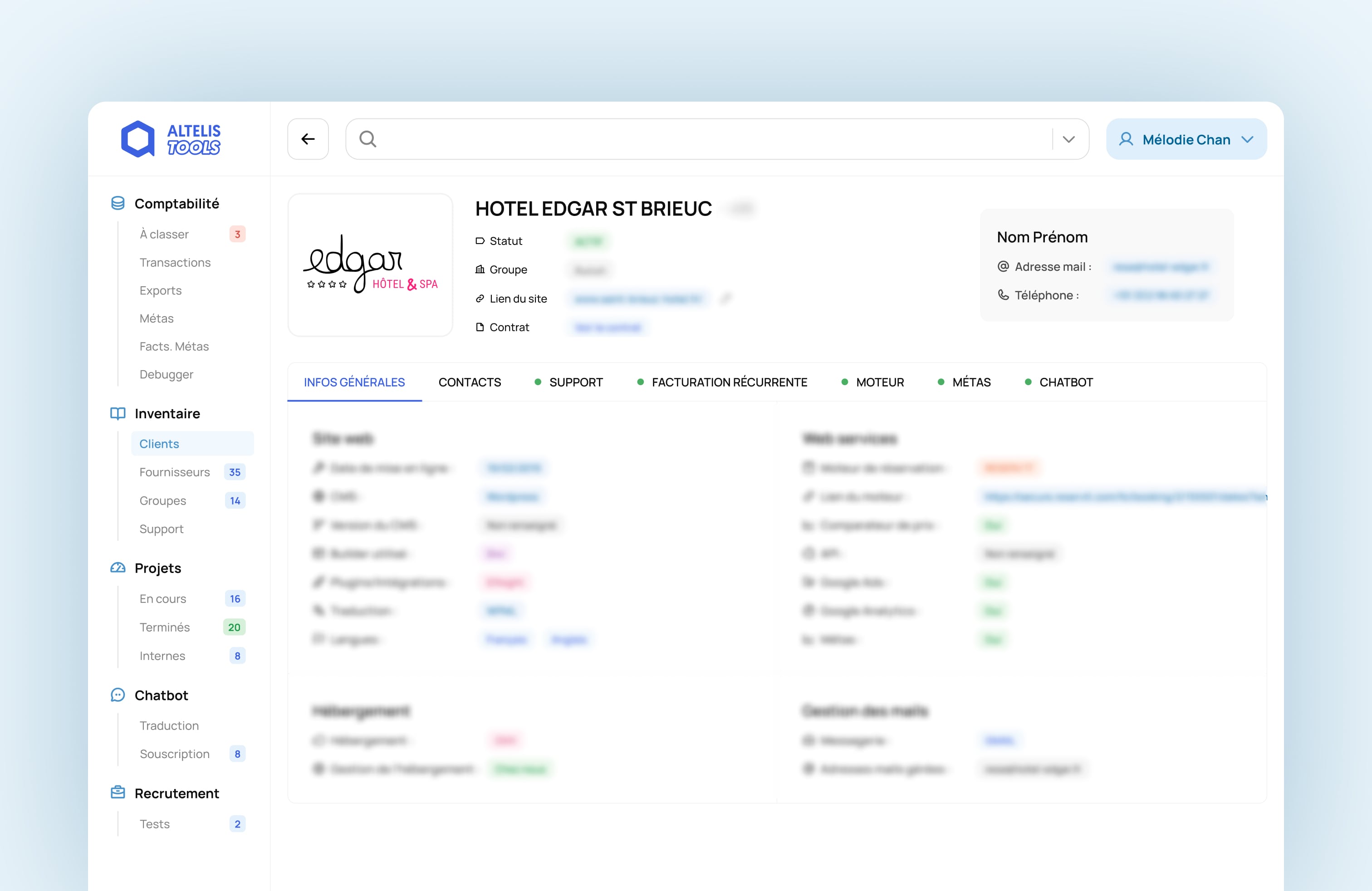
I designed a modular, tab-based navigation where each section focused on the needs of a specific team member:
The old percentage-based bar graph was replaced with a simple and explicit metric: “hours used / total hours allowed.” This small change made it instantly easier to understand resource usage.
Color cues (red for overrun, green for not overrun) helped users identify potential issues at a glance, improving clarity, confidence, and decision-making.
The biggest challenge was trust. Team members doubted the data because it wasn’t always up-to-date. To fix this, I suggested a system that connects directly to the data sources used by each department.
By collaborating with a developer, we defined:
This ensured that every piece of information shown on the dashboard was automatically updated and reliable, restoring confidence and efficiency.
To align the tool with the agency’s recent rebranding, I redesigned the interface using a fresh visual language.
I built a UI Kit with reusable components to ensure brand consistency across all internal tools and make future updates faster.
The result: a cohesive, scalable system that not only solved daily frustrations but also strengthened the agency’s internal brand and product ecosystem.
Although I left the company before the full rollout of the redesigned tool, the project was built with clear success metrics in mind : focused on efficiency, accessibility, and trust.
The impact of my design could have been measured through:
Since the company already had a daily time-tracking system used by every team member to log their hours per project phase, it would have been possible to measure the impact of the redesign in a very concrete way.
By analyzing this data after the rollout, we could have evaluated whether time spent on project management, and consequently its cost, had decreased, improving the profitability of that phase across several projects.
This experience reinforced a key learning for me as a designer: impact doesn’t stop at delivery.
Good design anticipates real-world use, defines how success will be measured, and empowers teams long after the work is done.
Sometimes, the biggest impact comes from helping teams trust their tools again and giving them back the time to focus on what truly matters.