A quick overview of the project
In July 2024, we created a dedicated section within Altelis Tools, our internal management platform, to centralize client information and optimize the management of client projects and maintenance services. The goal was to provide quick and organized access to essential data for the internal team, improving efficiency and reducing response times.

The Challenge
Altelis, a digital agency, identified a need to improve the way it managed client data and services. Team members reported difficulties accessing client information, which made it hard to understand and respond effectively to client requests.
Data was scattered across different tools, making:
- Retrieving client contact details slow and complicated,
- Analyzing website details difficult,
- Tracking contracts and services challenging.
This lack of organization was slowing down the team and impacting productivity.


Insights
In the initial assessment, we identified key issues:
- Difficult access: Data was spread across multiple platforms requiring various permissions, slowing the team down.
- Poor data visualization: For example, maintenance hours were shown as percentages, which was confusing since it did not clearly show hours used or remaining.
- Time wasted: Team members had to switch between tools to find information, increasing the risk of errors and outdated data.
These challenges highlighted the need for a centralized, clear, and easy-to-use solution.

Ideation
As the designer on this project, I structured the work into clear steps:
Data analysis
I conducted interviews with team members to identify the exact data to centralize and what they need to be able to work efficiently, it includes :
- Client contact details (name, company, contact),
- Managed website details (CMS, hosting, technical setup),
- History of provided services (site creation, maintenance, chatbots),
- Hours used per maintenance contract.
We ensured the data would update automatically to maintain accuracy.
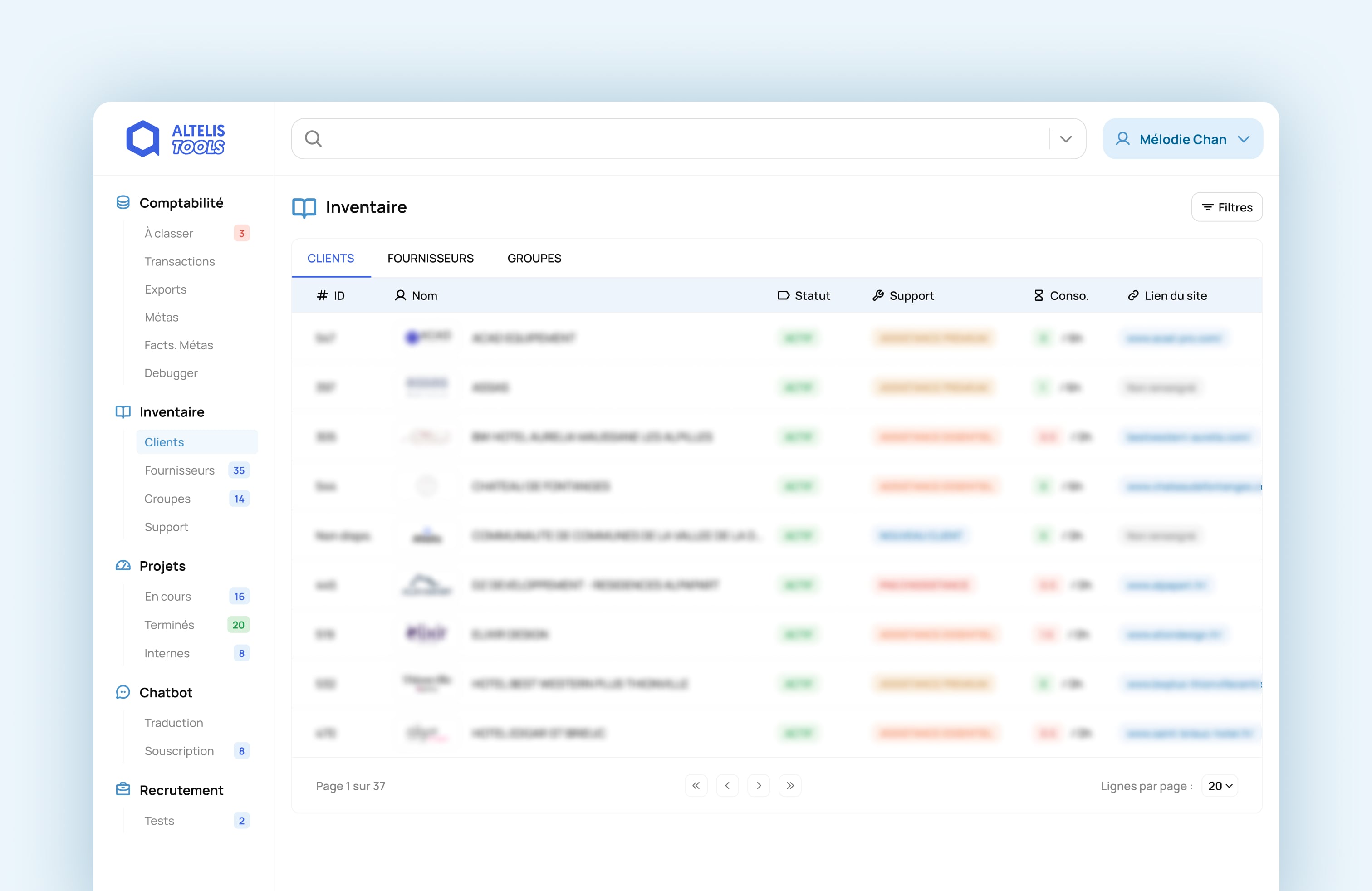
User-Friendly wireframes
I then designed clear navigation with themed tabs:
- A tab for client contacts and contract tracking,
- A section for technical website details,
- A clear view of hours used and remaining for each contract.
I followed the existing brand guidelines to maintain consistency with other internal tools.
Improved data visualization
I also replaced percentage charts with a clear display of hours used and remaining. Contextual details were added for each client to support quick understanding, with a clear hierarchy to reduce search time.
UI Kit Implementation
I developed a UI Kit in Figma to ensure consistency for future internal tools and created reusable components to speed up the design process.
Design Solutions
I created a clean, intuitive interface where the team could:
- Access client data with just a few clicks,
- View service usage clearly in hours,
- Navigate efficiently through organized tabs,
- Trust that data was accurate and current.
This ensured that the tool would support daily operations without friction, reducing stress and saving time for the team.
Handover & Development
To ensure smooth implementation, I provided developers with a detailed list of data to fetch dynamically, including:
- Client contacts,
- Technical website specifics,
- Service history,
- Hours used and remaining.
Dynamic data retrieval was emphasized to:
- Ensure up-to-date and reliable information,
- Reduce manual management time,
- Increase the efficiency and sustainability of the tool.


Results, Impact & Learnings
The project led to significant improvements:
- Improved efficiency: Client information is now easily accessible, reducing time spent retrieving data.
- Clearer visualization: Showing hours used and remaining removed confusion, helping developers and project managers track contracts effectively.
- Better user experience: A clear and intuitive interface improved daily workflows for project managers, sales teams, and maintenance managers.
Learnings and next steps:
- Stakeholder interviews were essential to understand specific needs and integrate them into the design.
- The importance of a robust design system became clear for maintaining consistency and scalability across internal tools.
- A wider rollout of the design system across all internal tools is planned to ensure visual and functional continuity within Altelis.